
A Swedish sports fan can jump from a live score to a highlight clip in seconds. The best mobile experiences remove small pauses that break attention. That is why ”one tap” design now matters across sports media and entertainment.
The shift shows up in everyday moments that decide if people stay or leave. Signing up and logging in should feel quick, even on a crowded commute. Payments need to be fast, with clear checks that keep users confident. Notifications should arrive at the right time, and small safety pauses can protect users in intense moments.
When these pieces work together, the phone stops feeling like a tool. It starts to feel like a remote control for the whole match day. Users can move from information to action without losing the story of the game.
Why One Tap Changes Everything
Frictionless design means fewer steps between intent and action. On a mobile screen, every extra field and extra tap raises the chance of drop off. However, speed alone is not the goal. A good product keeps the flow fast while still feeling clear and controlled.
Sign-ups That Do Not Break Focus
A fan often arrives through a link, a push alert, or a shared clip. If the first screen demands too much, the moment is lost. Many apps now delay heavy forms until the user truly needs them.
Sports media, gaming services, and review platforms share a common priority: enabling a fast start on mobile. Platforms like Nett.casino depend on this same streamlined mobile experience to engage users immediately. The key is to let people explore first, then ask for details when value is obvious. As a result, the user feels progress instead of paperwork during the first session.
Fast sign-ups still need smart guardrails. Autofill can pull basics from the phone, which reduces typing errors. Fingerprint or face sign in can replace passwords, which cuts reset loops. A short confirmation step can also prevent accidental account creation during late night browsing.
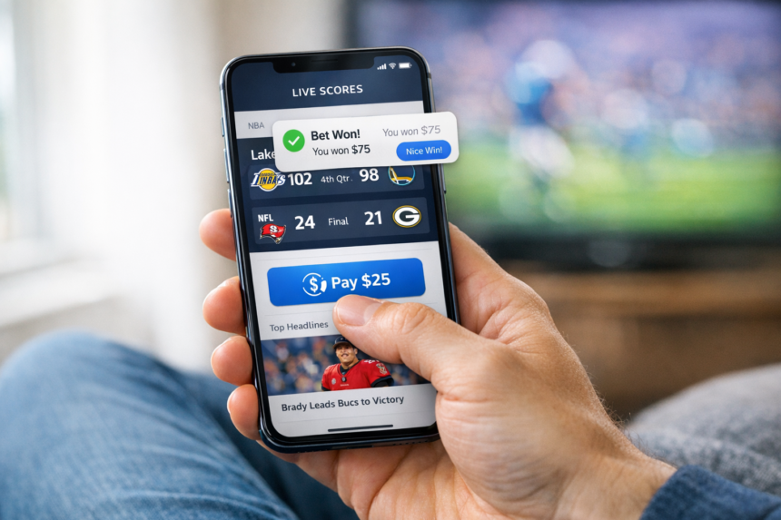
Payments That Feel Instant And Clear
Payments have become part of entertainment, not just shopping. Fans buy a match stream, tip a creator, or add funds for a game during live play, and studies of one-click checkout show how faster flows maintain engagement. When the checkout is slow, the excitement fades.
The best payment screens are simple, but not vague. Clear amounts, clear fees, and clear timing help users stay calm. In addition, a good receipt screen makes it easy to track what happened later.
A few design choices often separate smooth from stressful experiences. Familiar options like cards, bank transfer, and mobile wallets should sit in one place. The total cost should appear early, including any fees, so nothing feels hidden. Use one clear confirmation action, and lock the button until the result returns. With consent, saved preferences can make repeat actions take fewer taps next time.
When payments feel both quick and understandable, users stop second guessing every tap. Clear feedback also reduces support requests, since errors are easier to spot. Over time, trust grows because the same flow works in every situation.
Notifications That Respect The Moment
A live match creates real urgency, but most alerts are not urgent. Too many pushes train people to mute the app. Then the one message that matters never gets seen. That can make a reliable service feel strangely absent.
Helpful alerts are tied to personal choices. A user might want goals for one team, lineup news for another, and nothing else. Quiet hours also matter, especially for late games across time zones.
In Sweden, responsible design is a common expectation in regulated play and gaming. Public guidance from Spelinspektionen, Sweden’s Gambling Authority, signals that user protection should be built into the experience. These principles also translate well to sports media, where trust grows from calm signals.
Sometimes the best friction is intentional. A brief ”are you sure” screen can prevent a rushed tap during a heated moment. Simple limits, clear history, and easy settings give control back to the user. Good notifications should support the match, not compete with it.
Making Speed Work For Everyone
Frictionless design works best when it stays human. It should feel like a smooth path, not a trick that pushes people forward. Therefore, the strongest products pair speed with clarity at every step.
Small choices add up on mobile. A shorter form, a clearer payment screen, and calmer alerts can change daily habits. When design respects attention and control, one tap can feel effortless for the right reasons.